Trade Show Booth Design: Layouts, Principles & Branding Tips for 2026
Why Booth Design Matters More Than Ever
Your booth is your quiet salesperson. When the design works, people pause, step in, and start conversations. When it doesn’t, they walk past without a glance.
A well-planned booth layout and clear visual story can easily double or triple the number of people who actually stop long enough for your team to engage. We’ve pulled from real exhibitor wins, 10x10 layouts, and custom builds to give you practical trade show booth design ideas that work at craft fairs, vendor markets, and large expos alike.
Focus on flow, sightlines, and brand story first, then decide whether you keep it simple or bring in a custom Trade Show Labs build!

Trade Show Booth Design Principles That Actually Work
Start with the structure and visuals. If those miss, no amount of swag or giveaways will fix it.
Open flow first
Aim to keep roughly half of your floor space clear. Cramped booths feel awkward and tend to lose casual browsers quickly.
Push tables and counters to the perimeter and give visitors obvious places to step in and move around.
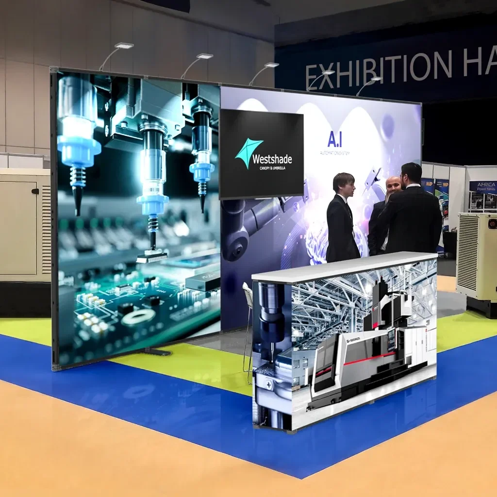
Vertical impact
Use your back wall like a billboard. An 8-foot wall with a bold, readable message (“Try the demo in 60 seconds”) will draw eyes from several booths away.
Add shelving, pegboard, or risers so product and key visuals sit at different heights instead of in one flat line.
Lighting
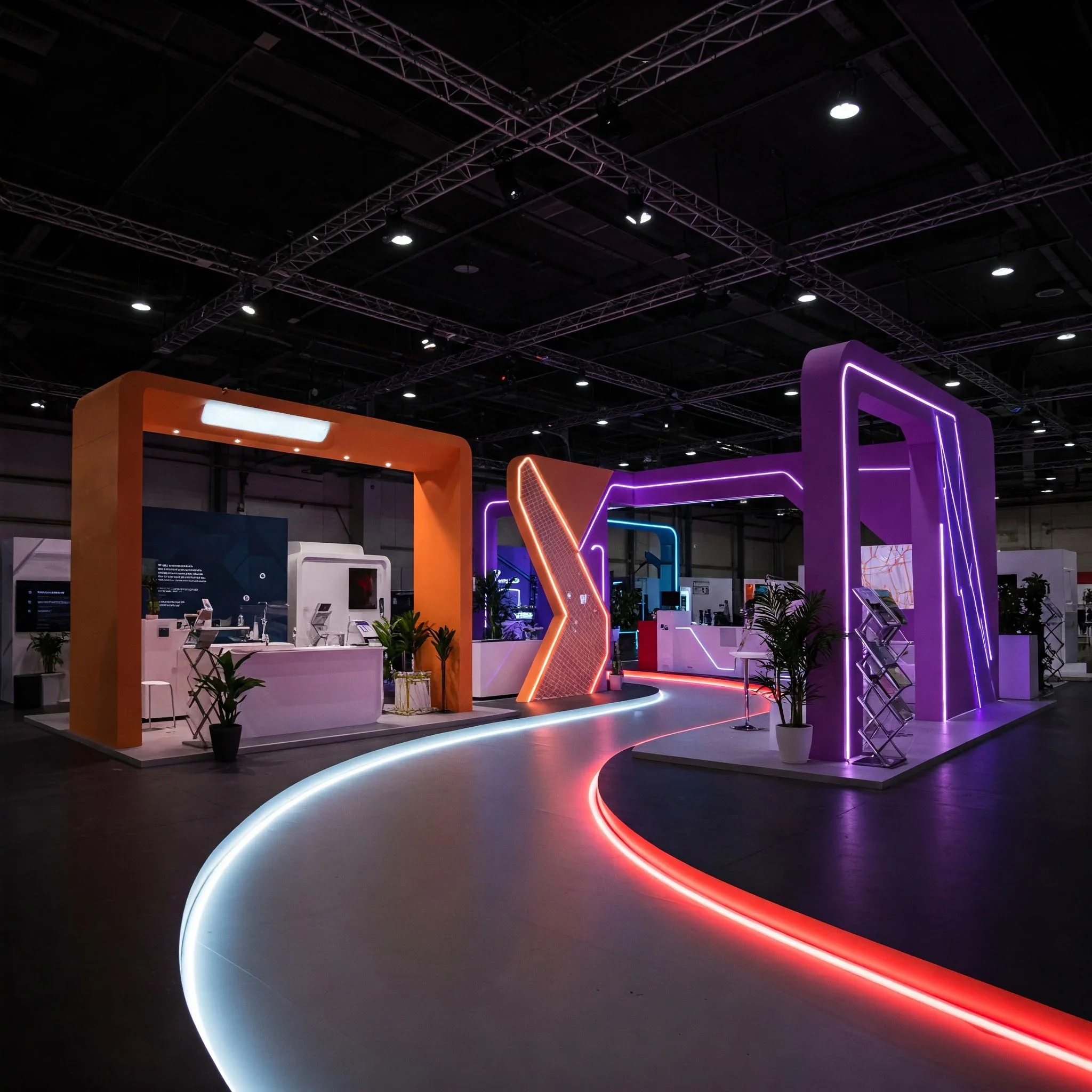
Overhead hall lighting is rarely kind. Add LED strips along the edges of displays and a few focused spotlights on hero products or demo areas.
Even simple battery-powered lights can make the booth feel intentional and more premium, which naturally boosts stopping power.
Color with a plan
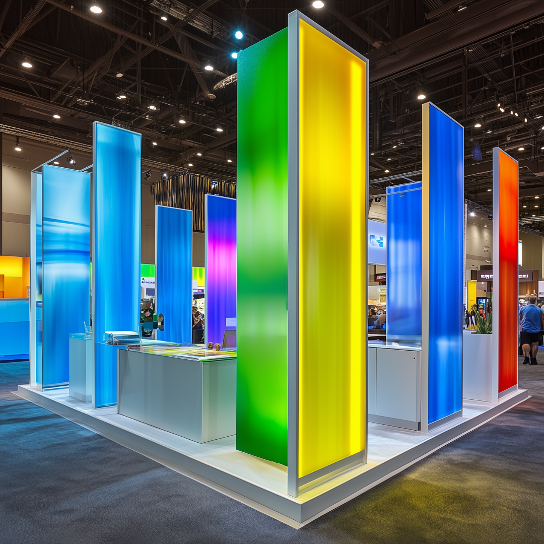
Pick a palette and stick to it.
A common rule: most of the booth in neutral tones, a solid portion in your main brand color, and a small pop for contrast. Tech brands might lean into high-contrast or neon accents, while eco-focused brands might use softer, more natural tones. Tie your choices back to what’s trending in your industry, especially around sustainability and modern, clean lines.
Modular setups
Design with future shows in mind. Modular frames, fabric graphics, and components that can be rearranged let you adapt from a small 10x10 footprint to a larger space without starting from scratch.
It cuts costs and makes it much easier to test what works from one event to the next.
Layout Examples You Can Steal
Choose a layout that matches your goals and space, then refine it rather than reinventing the wheel every time.
U-shape layout

Best for: live demos, hands-on products, and craft-style booths.
How it works: tables or counters run along three sides, leaving the front open. Visitors step into the space instead of hovering in the aisle.
Design tip: add a small island or pedestal in the center with samples or a demo item so people naturally move deeper into the booth.
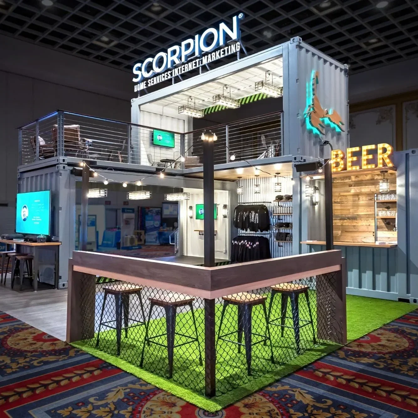
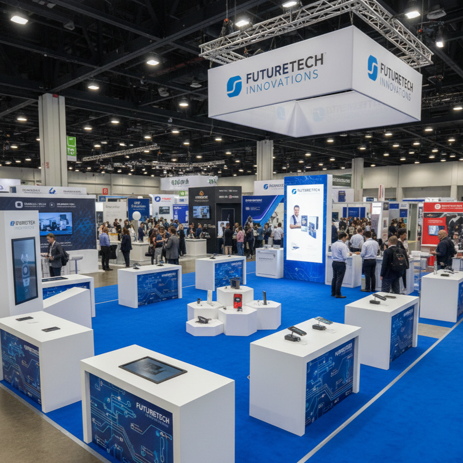
Island or open layout
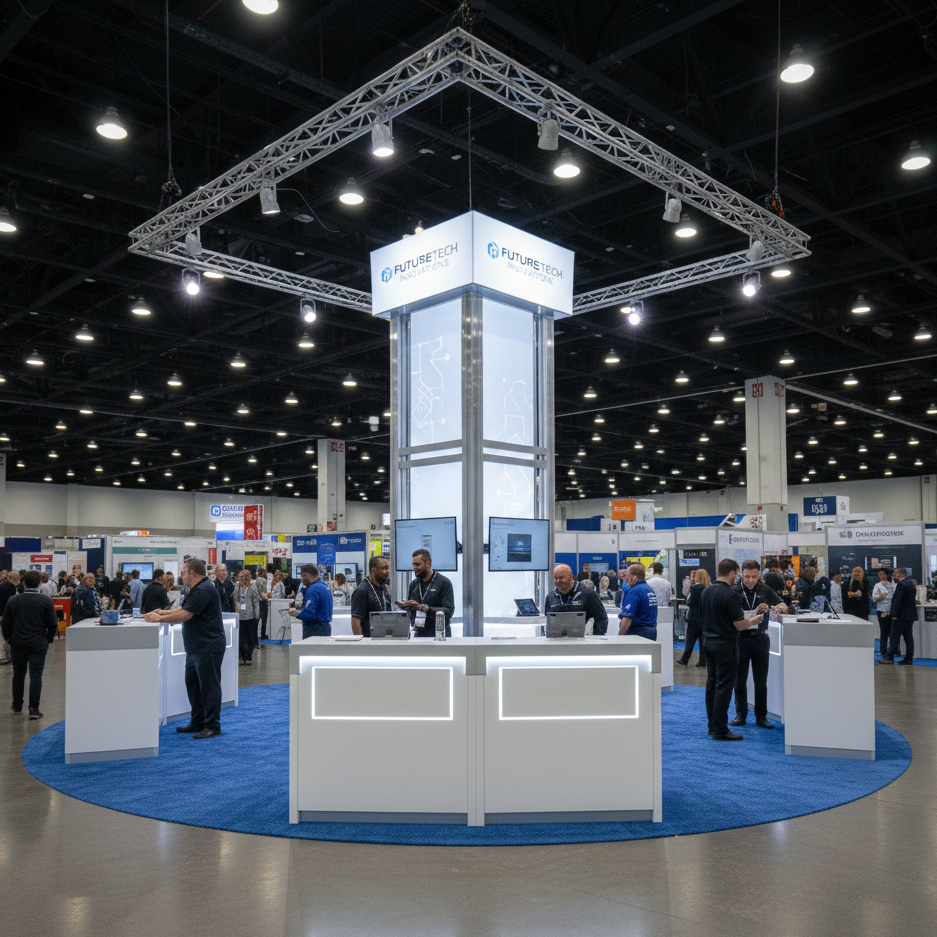
Best for: high-traffic areas and larger footprints.
How it works: low counters or kiosks sit around the edges, with a strong vertical element in the middle, such as a tower or branded structure. Visitors can approach from any direction.
Design tip: make sure your main message and branding are visible from multiple aisles, not just one.
L-shape layout
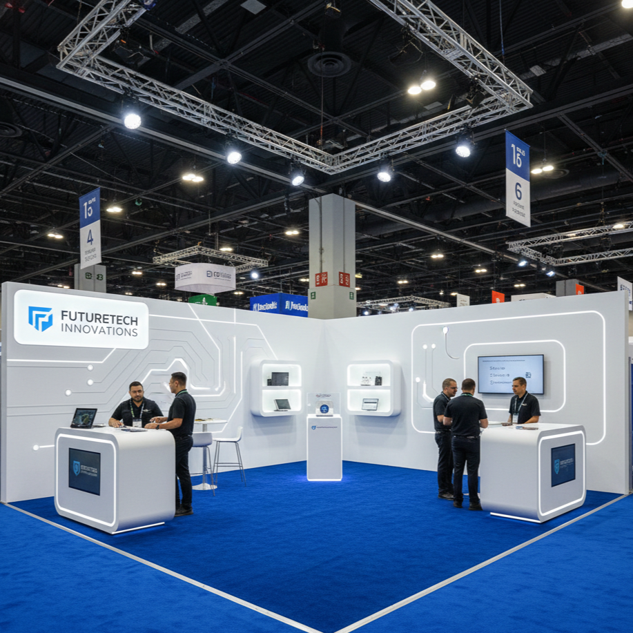
Best for: corner locations and standard 10x10 spaces.
How it works: one long wall and one shorter side hold most of your displays, leaving a generous area for people to step in.
Design tip: use the “inner corner” for shelving or a small feature display so no part of the booth feels like dead space.
Zig-zag or staggered layout
Best for: brands with several product categories or stories.
How it works: tables or display units are staggered in a loose zig-zag pattern, creating a natural path for the eye and for foot traffic.
Design tip: vary the height and depth of displays so each section feels like its own mini scene without blocking the overall view.
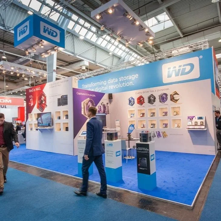
Minimalist layout
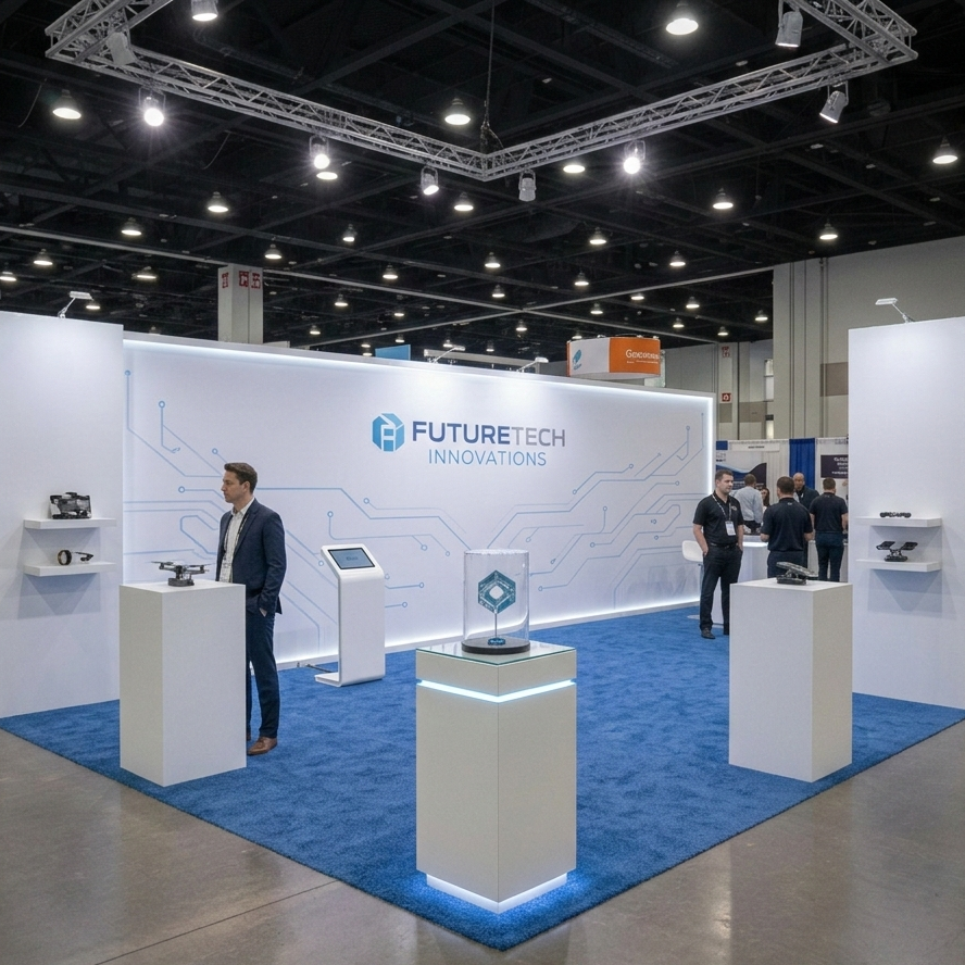
Best for: premium, design-forward brands.
How it works: one strong focal wall, a small number of products or samples, and lots of negative space.
Design tip: use floating shelves, clean lines, and higher-end finishes so the booth feels intentional rather than empty.
For smaller events and markets, you can adapt these layouts to a tighter 10x10 footprint and borrow specific configurations and fixture ideas from your dedicated 10x10 booth layout guide. For national shows or more complex spaces, use these same layouts as the base and then build out a custom design with a professional team.
Branding That Shows, Not Just Tells
Good booth design should make it obvious who you are and why someone should care within a few seconds.
Turn your booth into a story
Think in simple stages: front, middle, back.
At the front, a short, punchy hook addresses a clear problem or promise.
In the middle, a demo or sample lets visitors experience what you do.
At the back, you close the loop with clear next steps or deeper information.
The visuals, copy, and layout should all support that story arc, whether your brand leans more nostalgic, futuristic, playful, or serious.
Make branding interactive
Instead of relying only on static graphics, bake interaction into the design itself.
That might mean a scannable wall of QR codes that lead to short videos or case studies, a small photo moment with branded props, or an element visitors can sign, vote on, or add to during the show.
When people physically interact with something in your space, they’re more likely to remember you later.
Keep it consistent with your online presence
Use the same core colors, fonts, and tone of voice your audience sees on your website and social channels. That visual consistency makes your booth instantly recognizable to existing customers and builds trust with new ones.
*ATTENTION: Before committing to print or fabrication, build simple mockups so you can see how all the pieces work together.
Lean into sustainability where it fits
More attendees and buyers are paying attention to how things are made.
Materials like recycled fabric graphics, reusable structures, and multi-use components not only reduce waste but also give you a story to tell in the booth.
Small touches, like clearly labeled recycling points or messaging that highlights your sustainable choices, can set you apart from a row of generic setups.
Measure and refine
Treat each show as a test. Take photos of your booth before doors open, during peak times, and after any changes you make. Track how many people stop, how long they stay, and how many turn into leads or conversations. Each event gives you data on what works, so you can adjust future layouts, signage, and focal points instead of guessing.
Turn Your Design Into a Real Booth
Once you have a rough idea of your layout, message, and must-have elements, sketch the plan on paper or in a simple digital tool. From there, you can hand it off to a professional team to translate into a full design, build, and logistics plan.
If you already have a few smaller shows under your belt, start with those as testing grounds. Try one or two changes at a time, then roll the winners into your larger events. Pair that process with a solid trade show checklist so you don’t overlook small details that can undermine a great design, like power access, cable management, or sign placement.
Over time, you’ll have a booth that not only looks sharp in photos but consistently draws people in and supports your sales goals.

And last, but not least, if you're ready to turn your ideas into a real, working booth; share a bit about your space, goals, and next show date, and the Trade Show Labs team can help you build a plan that fits your budget.
Reach out today to start and make your next exhibit the one people talk about long after the show ends.
William Griggs
Founder @ Trade Show Labs